Overview
Teaching: 5 min Exercises: 5 minQuestions
What makes up a publication quality figure?
What customization features are in
ggplot2?Objectives
To generate a publication quality figure using
ggplot2
ggplot2 customization for publication quality figures
labs()theme()guide_legend()
Line Histogram Fill-in Challenge Continued
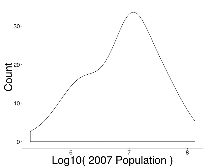
Fill in the missing pieces of the following code to generate a publication quality line histogram.
ggplot(________) +
  ________ +
  labs(________, y = "Count") +
  theme_classic(base_size = 24, base_family = ________) +
  theme(axis.title = element_text(size = 36))
Output Solution
Code Solution
ggplot(Africa, aes(log10(pop_2007), ..count..)) +
  geom_density() +
  labs(x = "Log10( 2007 Population )", y = "Count") +
  theme_classic(base_size = 24, base_family = "Helvetica") +
  theme(axis.title = element_text(size = 36))
Key Points
Publication quality figures stand alone to address a scientific question.
Publication quality figures include clear headings, labels, and symbols.
Publication quality figures are often accompanied by a descriptive caption.