Overview
Teaching: 10 min Exercises: 5 minQuestions
What is the grammar of graphics established by
ggplot2?How does
ggplot2generate graphics through layers?Objectives
To understand
ggplot2aesthetic mapping of layersTo generate graphics using
ggplot2
ggplot2implements the notion that every plot is drawn by adding layers on top of one another - just like as if you were drawing.
Suppose you were asked to draw a graph. Before drawing, you would possibly have several questions on how to do it: 1. Which data should be mapped into the plot: is it the relationship between a categorical and a continuous variable, or that between two continuous variables; 2. Which geometrical representation should you use: a bar, a point or a density line? 3. You may also determine the appearance, the aesthetic, of the geometrical elements: are they going to be colored or filled? If they are a point, should it be a circle, a square or a triangle?
It is this reasoning from the Grammar of Graphics that is used to create plots in the
ggplot2 package.
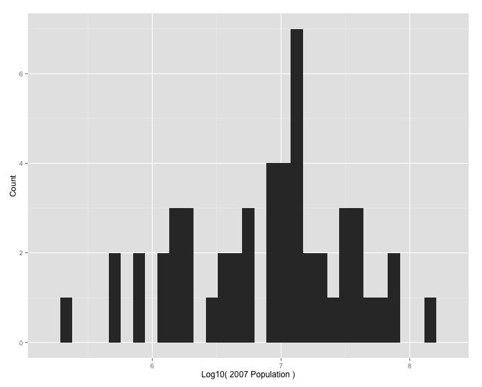
Implement histogram for “How was the population of Africa distributed across the continent by country in 2007?”
ggplotShuffle ChallengeRearrange the following code to generate a histogram.
geom_histogram() +
labs(x = "Log10( 2007 Population )", y = "Count")
ggplot(Africa, aes(log10(pop_2007))) +
Output Solution
Code Solution
ggplot(Africa, aes(log10(pop_2007))) +
 geom_histogram() +
 labs(x = "Log10( 2007 Population )", y = "Count")
Key Points
Use
ggplot2to visualize and analyze data.