Overview
Teaching: 10 min Exercises: 5 minQuestions
How do I choose a good chart to visualize my data?
Objectives
To match scientific question with a good chart
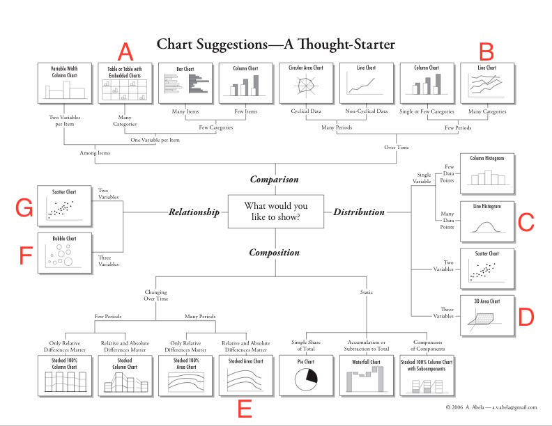
Introduce Choosing a Good Chart.
Break down chart decision for: “How was the population of Africa distributed across the continent by country in 2007?”
Good Chart Challenge
Match the scientific questions with the corresponding graphic on Choosing a Good Chart.
- A. Distribution: How was the population of Africa distributed across the continent by country in 2007?
- B. Relationship: What is the relationship of GDP per capita, life expectancy, and population across the world per country in 2007?
- C. Comparison: How was the world population distributed among continents in 2007?
- D. Composition: How has the composition of the world population among continents changed from 1952-2007?
Answer
- A. - C. Line Histogram
- B. - F. Bubble Chart
- C. - A. Table with Embedded Charts
- D. - E. Stacked Area Chart
Key Points
A good chart directly and clearly addresses a scientific question.