Plotting data
Last updated on 2025-01-08 | Edit this page
Overview
Questions
- How can I process and visualize my data?
Objectives
- Perform operations on arrays of data.
- Display simple graphs.
Analyzing patient data
Now that we know how to access data we want to compute with, we’re
ready to analyze patient_data. MATLAB knows how to perform
common mathematical operations on arrays. If we want to find the average
inflammation for all patients on all days, we can just ask for the mean
of the array:
OUTPUT
ans = 6.1487We couldn’t just do mean(patient_data) because, that
would compute the mean of each column in our table, and return
an array of mean values. The expression patient_data(:)
flattens the table into a one-dimensional array.
To get details about what a function, like mean, does
and how to use it, we can search the documentation, or use MATLAB’s
help command.
OUTPUT
mean   Average or mean value.
    S = mean(X) is the mean value of the elements in X if X is a vector.
    For matrices, S is a row vector containing the mean value of each
    column.
    For N-D arrays, S is the mean value of the elements along the first
    array dimension whose size does not equal 1.

    mean(X,DIM) takes the mean along the dimension DIM of X.

    S = mean(...,TYPE) specifies the type in which the mean is performed,
    and the type of S. Available options are:

    'double'    -  S has class double for any input X
    'native'    -  S has the same class as X
    'default'   -  If X is floating point, that is double or single,
                   S has the same class as X. If X is not floating point,
                   S has class double.

    S = mean(...,NANFLAG) specifies how NaN (Not-A-Number) values are
    treated. The default is 'includenan':

    'includenan' - the mean of a vector containing NaN values is also NaN.
    'omitnan'    - the mean of a vector containing NaN values is the mean
                   of all its non-NaN elements. If all elements are NaN,
                   the result is NaN.

    Example:
        X = [1 2 3; 3 3 6; 4 6 8; 4 7 7]
        mean(X,1)
        mean(X,2)

    Class support for input X:
       float: double, single
       integer: uint8, int8, uint16, int16, uint32,
                int32, uint64, int64

    See also median, std, min, max, var, cov, mode.
We can also compute other statistics, like the maximum, minimum and standard deviation.
MATLAB
>> disp('Maximum inflammation:')
>> disp(max(patient_data(:)))
>> disp('Minimum inflammation:')
>> disp(min(patient_data(:)))
>> disp('Standard deviation:')
>> disp(std(patient_data(:)))
OUTPUT
Maximum inflammation:
20
Minimum inflammation:
0
Standard deviation:
4.6148
When analyzing data though, we often want to look at partial statistics, such as the maximum value per patient or the average value per day. One way to do this is to assign the data we want to a new temporary array, then ask it to do the calculation:
MATLAB
>> patient_1 = patient_data(1, :)
>> disp('Maximum inflation for patient 1:')
>> disp(max(patient_1))
OUTPUT
Maximum inflation for patient 1:
18
We don’t actually need to store the row in a variable of its own. Instead, we can combine the selection and the function call:
OUTPUT
ans = 18What if we need the maximum inflammation for all patients, or the average for each day? As the diagram below shows, we want to perform the operation across an axis:

To support this, MATLAB allows us to specify the dimension we want to work on. If we ask for the average across the dimension 1, we’re asking for one summary value per column, which is the average of all the rows. In other words, we’re asking for the average inflammation per day for all patients.
OUTPUT
ans =
  Columns 1 through 10
         0    0.4500    1.1167    1.7500    2.4333    3.1500    3.8000    3.8833    5.2333    5.5167
  Columns 11 through 20
    5.9500    5.9000    8.3500    7.7333    8.3667    9.5000    9.5833   10.6333   11.5667   12.3500
  Columns 21 through 30
   13.2500   11.9667   11.0333   10.1667   10.0000    8.6667    9.1500    7.2500    7.3333    6.5833
  Columns 31 through 40
    6.0667    5.9500    5.1167    3.6000    3.3000    3.5667    2.4833    1.5000    1.1333    0.5667
If we average across axis 2, we’re asking for one summary value per row, which is the average of all the columns. In other words, we’re asking for the average inflammation per patient over all the days:
OUTPUT
ans =

   5.4500
   5.4250
   6.1000
   5.9000
   5.5500
   6.2250
   5.9750
   6.6500
   6.6250
   6.5250
   6.7750
   5.8000
   6.2250
   5.7500
   5.2250
   6.3000
   6.5500
   5.7000
   5.8500
   6.5500
   5.7750
   5.8250
   6.1750
   6.1000
   5.8000
   6.4250
   6.0500
   6.0250
   6.1750
   6.5500
   6.1750
   6.3500
   6.7250
   6.1250
   7.0750
   5.7250
   5.9250
   6.1500
   6.0750
   5.7500
   5.9750
   5.7250
   6.3000
   5.9000
   6.7500
   5.9250
   7.2250
   6.1500
   5.9500
   6.2750
   5.7000
   6.1000
   6.8250
   5.9750
   6.7250
   5.7000
   6.2500
   6.4000
   7.0500
   5.9000
We can quickly check the size of this array:
OUTPUT
ans =
    60    1
The size tells us we have a 60-by-1 vector, confirming that this is the average inflammation per patient over all days in the trial.
Plotting
The mathematician Richard Hamming once said, “The purpose of computing is insight, not numbers,” and the best way to develop insight is often to visualize data. Visualization deserves an entire lecture (or course) of its own, but we can explore a few features of MATLAB here.
Let’s display a heat map of our data:
MATLAB
>> imagesc(patient_data)
>> title('Inflammation')
>> xlabel('Day of trial')
>> ylabel('Patient number')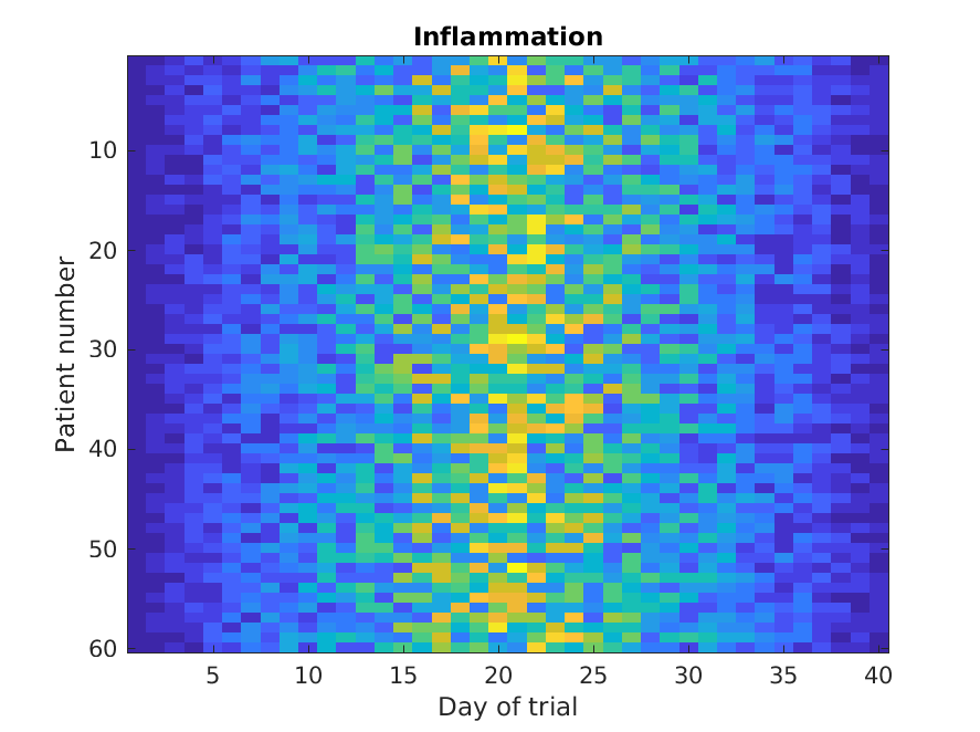
The imagesc function represents the matrix as a color
image. Every value in the matrix is mapped to a color. Blue
regions in this heat map are low values, while yellow shows high values.
As we can see, inflammation rises and falls over a 40 day period.
It’s good practice to give the figure a title, and to
label the axes using xlabel and ylabel so that
other people can understand what it shows (including us if we return to
this plot 6 months from now).
Let’s take a look at the average inflammation over time:
MATLAB
>> plot(mean(patient_data, 1))
>> title('Daily average inflammation')
>> xlabel('Day of trial')
>> ylabel('Inflammation')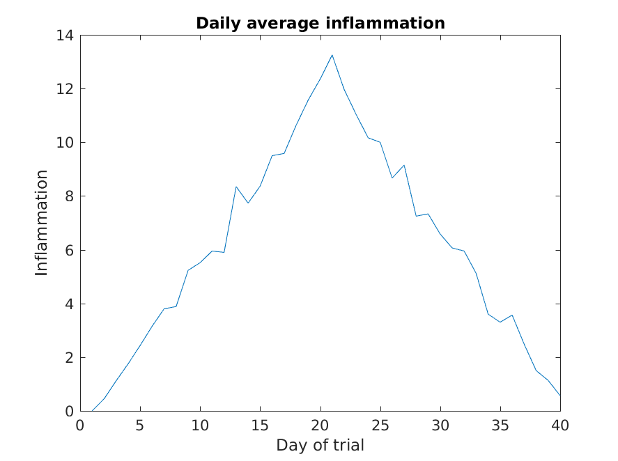
Here, we have calculated the average per day across all patients then
used the plot function to display a line graph of those
values. The result is roughly a linear rise and fall, which is
suspicious: based on other studies, we expect a sharper rise and slower
fall. Let’s have a look at two other statistics: the maximum and minimum
inflammation per day across all patients.
MATLAB
>> plot(max(patient_data, [], 1))
>> title('Maximum inflammation per day')
>> ylabel('Inflammation')
>> xlabel('Day of trial')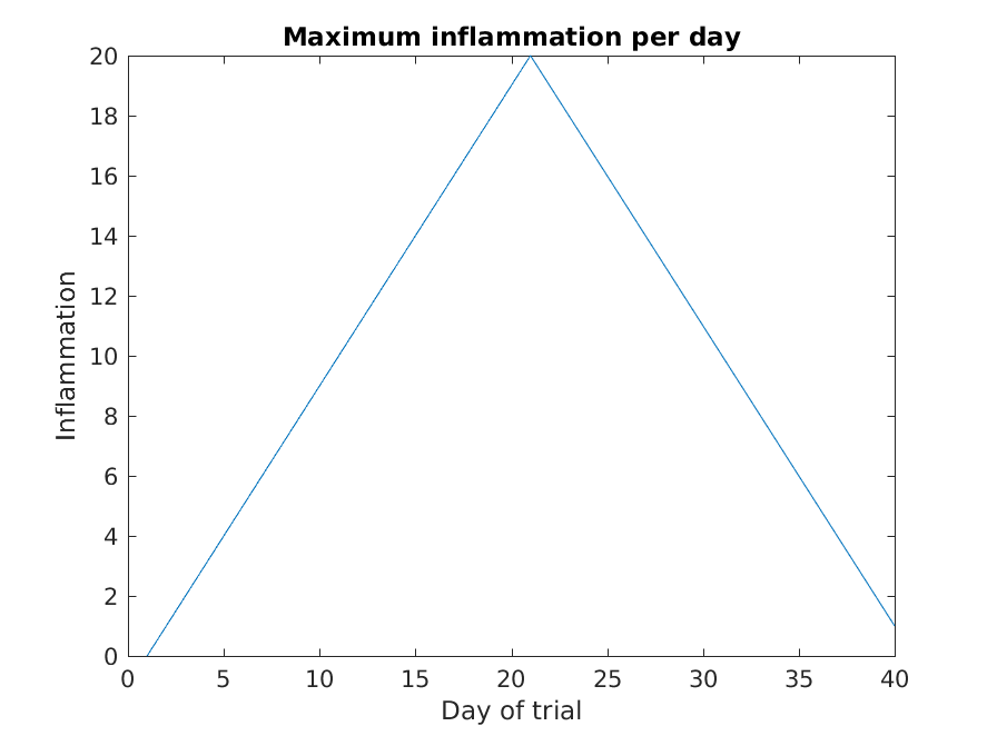
MATLAB
>> plot(min(patient_data, [], 1))
>> title('Minimum inflammation per day')
>> ylabel('Inflammation')
>> xlabel('Day of trial')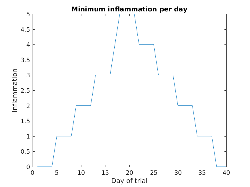
Like mean(), the functions max() and
min() can also operate across a specified dimension of the
matrix. However, the syntax is slightly different. To see why, run a
help on each of these functions.
From the figures, we see that the maximum value rises and falls perfectly smoothly, while the minimum seems to be a step function. Neither result seems particularly likely, so either there’s a mistake in our calculations or something is wrong with our data.
Plots
When we plot just one variable using the plot command
e.g. plot(Y) or plot(mean(patient_data, 1)),
what do the x-values represent?
The x-values are the indices of the y-data, so the first y-value is plotted against index 1, the second y-value against 2 etc.
Plots (continued)
Why are the vertical lines in our plot of the minimum inflammation per day not perfectly vertical?
MATLAB interpolates between the points on a 2D line plot.
Plots (continued)
Create a plot showing the standard deviation of the inflammation data for each day across all patients. Hint: search the documentation for standard deviation
It is often convenient to combine multiple plots into one figure
using the subplot command which plots our graphs in a grid
pattern. The first two parameters describe the grid we want to use,
while the third parameter indicates the placement on the grid.
MATLAB
>> subplot(1, 2, 1)
>> plot(max(patient_data, [], 1))
>> ylabel('max')
>> xlabel('day')

>> subplot(1, 2, 2)
>> plot(min(patient_data, [], 1))
>> ylabel('min')
>> xlabel('day')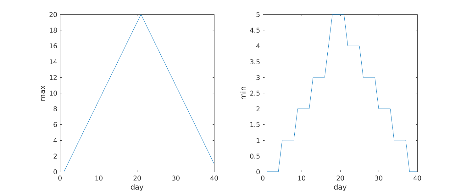
Our work so far has convinced us that something is wrong with our first data file. We would like to check the other 11 the same way, but typing in the same commands repeatedly is tedious and error-prone. Since computers don’t get bored (that we know of), we should create a way to do a complete analysis with a single command, and then figure out how to repeat that step once for each file. These operations are the subjects of the next two lessons.
- Use
plotto visualize data.