Overview
Teaching: 15 min Exercises: 0 minQuestions
FIXME
Objectives
Construct a simple visualization using pyplot.
Long lists of numbers are not particularly useful, but we now have the tools we need to visualize the temperature differences between countries:
from matplotlib import pyplot as plt

australia = annual_mean_temp('AUS')
canada = annual_mean_temp('CAN')
diff = diff_records(australia, canada)
plt.plot(diff)
plt.show()
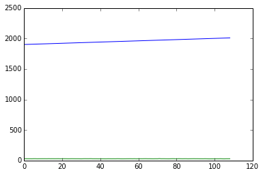
That’s not what we want:
pyplot has interpreted the list of pairs returned by annual_mean_temp
as two corresponding curves rather than as the (x,y) coordinates for one curve.
Let’s convert our list of (year, difference) pairs into a NumPy array:
import numpy as np
d = np.array(diff)
and then plot the first column against the second:
plt.plot(d[:, 0], d[:, 1])
plt.show()
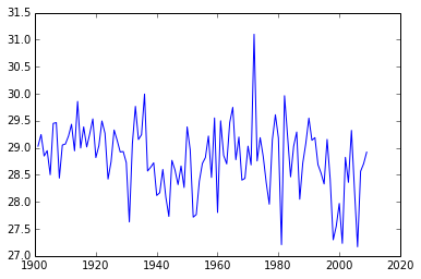
It looks like the difference is slowly decreasing, but the signal is very noisy. At this point, if we wanted to do some real science, it would be time to use a curve-fitting library or calculate some meaningful statistics.
Changing Visualizations
Modify the plotting commands so that the Y-axis scale runs from 0 to 32. Do you think this gives you a more accurate or less accurate view of this data?
Key Points
FIXME