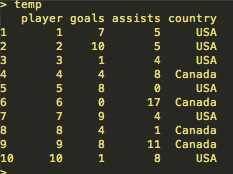
Consider the following dataset named “temp” of the goals and assists scored by 10 hockey players from the USA and Canada:
Q1. Using ggplot2 in R, how would you make a scatter plot of the number of goals against number of assists, coloured by the country?
a) ggplot(data=temp, x=goals, y=assists, col=country)
b) ggplot(data=temp, x=goals, y=assists, aes(col=country)) + geom_point()
c) ggplot(data=temp, aes(x=goals, y=assists)) + geom_line(aes(col=country))
d) ggplot(data=temp, aes(x=goals, y=assists, col=country)) + geom_point()
Q2. Using ggplot2 in R, how would you fit a regression line with 95% confidence intervals to the scatter plot you made in Q1?