Introduction
One of the python packages that I am most impressed with, and that I find most useful, is APLpy, a.k.a. the Astronomical Plotting Library for python. APLpy builds upon matplotlib to provide an easy way to plot astronomical images. It therefore offers all of matplotlib’s advantages, including the ability to save images in several formats (e.g. EPS, PDF, PNG, SVG).
The most traditional way to view astronomical images in the FITS format is to use the ds9 program. I have used ds9 many times to produce images for publications: it is very powerful and allows pretty much any modification, but it can also be cumbersome and difficult at times. Furthermore, it is necessary to start from scratch every time a modification to a saved image needs to be done.
Note: APLpy is an affiliated package of astropy. As such, APLpy requires astropy but is no part of it, and it therefore needs to be installed separately.
Step-by-step demonstration
Let me demonstrate how easy it is to produce a publication-quality image with APLpy in just a few lines.
In January 2014, a very bright supernova, SN 2014J, was discovered in the nearby Messier 82 (M82) galaxy. It is the closest type-Ia supernova discovered in over 40 years, and it reached its peak brightness on January 31, 2014 with a V magnitude of 10.5.
As an example, we will create an image showing the location of the supernova superimposed over an image of M82.
— Download a FITS image of the M82 galaxy; there are many options, including images from:
- the Hubble Space Telescope (HST), 4 different filters available;
- the Chandra X-ray Observatory (Chandra), 7 different energy bands available;
- the Wide-field Infrared Survey Explorer (WISE), provided as part of the python4astronomers tutorial.
Note that the Chandra webpage also contains observations of many other famous targets, if you would like to create an image with a different object.
For this example, we will use one of the infrared image obtained by WISE (the file w1.fits in this set); in all instructions below, that image will be referred to as “image.fits”
— Start python, or ipython, or open an ipython notebook:
python # OR<br />
ipython # OR<br />
ipython notebook
— If you use ipython notebook, create a new notebook and setup the backend:
%matplotlib inline
— Import the APLpy package:
import aplpy
— Read the image (as a FITS file):
fig = aplpy.FITSFigure('image.fits')
From now on, interactions with the figure will occur by calling methods of the “fig” object.
Notes:
- If you are using
python/ipython, a normalmatplotlibwindow should open, empty except for a set of axes coordinates. Subsequent commands will update that window (additional commands may be necessary, such asshow()anddraw(), depending on yourmatplotlibsetup). - If you are using
ipython notebookwith theinlinebackend (e.g you typed%matplotlib inline), an empty image except for a set of axes coordinates will be shown. However, with theinlinebackend, images are closed by default at the end of each cell, thus subsequent commands typed in other cells will modify thefigobject, but nothing will be shown. There are different ways to solve this, but the easiest solution is simply to type all the APLpy commands in a single cell.
— Show the image with a grey scale:
fig.show_grayscale()
This command chooses automatic minimum/maximum values for the colorbar, and uses a linear stretch.
— Hide the image:
fig.hide_grayscale()
— Change the colorbar by imposing the minimum/maximum values and imposing a root-square stretch:
fig.show_grayscale(vmin=1.0,vmax=3000., stretch='sqrt')
Available options for the stretch are: ‘linear’ (default), ‘log’, ‘sqrt’, ‘arcsinh’, ‘power’
— Show the image with a color scale instead:
fig.show_colorscale()
— Show the image with a different color scale:
fig.show_colorscale(cmap='gist_heat')
The color scale can be chosen among this list. Any color map can be reversed by adding _r at the end of its name (e.g. cmap=’gist_heat_r’). Alternatively, the color map can be reversed by setting the invert argument to True (invert=True) in the show_colorscale() or show_greyscale() methods.
— Change the colorbar by imposing the minimum/maximum values and imposing a logarithmic stretch:
fig.show_colorscale(vmin=1.0,vmax=5000., stretch='log', cmap='gist_heat')
— Add a scalebar to indicate the size of the image (by plotting a scale for 0.05 degrees), placed in the top right corner:
fig.add_scalebar(0.05, "0.05 degrees", color='white', corner='top right')
— APLpy creates attributes when different objects are added to the figure (such as grid, scalebar, colorbar, beam). Once an attribute exist, it can be accessed and modified directly. For instance, change the text of the scalebar to mention what the 0.05 angular separation correspond to expressed in parsec:
fig.scalebar.set_label("3 kpc")
— Change the grid spacing (to be 0.1 degree):
fig.ticks.set_xspacing(0.1)<br />
fig.ticks.set_yspacing(0.1)
— Revert to the default grid spacing:
fig.ticks.set_xspacing('auto')<br />
fig.ticks.set_yspacing('auto')
— Change the formatting of the tick labels (to avoid showing only zeros for the decimals of the seconds on the X axis, and for the seconds on the Y axis):
fig.tick_labels.set_xformat('hh:mm:ss')<br />
fig.tick_labels.set_yformat('dd:mm')
— Change the font of the axis labels and of the ticks labels to be larger than the default value:
fig.axis_labels.set_font(size='large')<br />
fig.tick_labels.set_font(size='large')
Available options for the font sizes are the ones defined in matplotlib.
— Revert to the default font size for the axis labels and for the ticks labels:
fig.axis_labels.set_font(size=None)<br />
fig.tick_labels.set_font(size=None)
— Add a grid over the image:
fig.add_grid()
— APLpy uses the concept of layers for a number of things that can be plotted over the image, such as markers, contours). To view the layers currently attached to an image:
fig.list_layers()
Layers receive default names (such as marker_set_1, contour_set_1, etc), but it is possible to name them explicitly by specifying the layer argument to the different methods that create layers. Any layer can be shown, hidden, or removed at any time using the following commands: show_layer(), hide_layer(), remove_layer(). Any layer can also be retrieved using get_layer().
— Add a marker to indicate the position of the supernova SN 2014J:
ra, dec = 148.925904, 69.674044<br />
fig.show_markers(ra, dec, layer='markers', edgecolor='green', facecolor='none', marker='o', s=10, alpha=0.5)
If there were more than one marker to be plotted, the positions could be given in a list (e.g. ra, dec = [148.925904, 148.968458], [69.674044, 69.679703]). Note that the show_markers() method calls the scatter() method from matplotlib, so all arguments from that method can be used.
— At this point, there is a single layer named ‘markers’:
fig.list_layers()
— Change the markers to be more visible:
fig.show_markers(ra, dec, layer='markers', edgecolor='black', facecolor='none', marker='o', s=30, alpha=0.5, linewidths=20)
Note that the name of the layer is specified explicitly, so the command above replaces the existing markers (otherwise, it would create an additional layer).
— Add a label to indicate the location of SN 2014J:
fig.add_label(ra, dec-0.01, 'SN 2014J', layer='source', color='white')
— Add a title:
fig.add_label(0.5, 1.05, 'Location of the supernova SN 2014J in M82', relative=True, size='large', layer='title')
— Use a preset theme for publication:
fig.set_theme('publication')
Available options for preset themes are: ‘publication’ (adapted for publication), ‘pretty’ (adapted for screen visualization)
— The preset theme does not set the colorbar and the image label to be black, so do this manually:
fig.scalebar.set_color('black')<br />
fig.list_layers()<br />
label = fig.get_layer('source')<br />
label.set_color('black')
— Save the image created (in the format of your choice):
fig.save('SN_in_M82.eps')<br />
fig.save('SN_in_M82.pdf')<br />
fig.save('SN_in_M82.svg')<br />
fig.save('SN_in_M82.png')
APLpy has many more capabilities, including:
- Loading ds9 regions:
fig.show_contour('data.fits', colors='white') - Overploting contours:
fig.show_regions('regions.reg') - Recentering the image on any location:
fig.recenter(ra, dec, radius=0.05)<br />
fig.recenter(ra, dec, width=0.05, height=0.03)
Summary of the APLpy commands
The final publication-quality image has been produced using only a handful of commands:
import aplpy<br />
fig = aplpy.FITSFigure('image.fits')<br />
fig.show_colorscale(vmin=1.0,vmax=5000., stretch='log', cmap='gist_heat')<br />
fig.add_scalebar(0.05, "3 kpc", color='white', corner='top right')<br />
fig.tick_labels.set_xformat('hh:mm:ss')<br />
fig.tick_labels.set_yformat('dd:mm')<br />
fig.add_grid()<br />
ra, dec = 148.925904, 69.674044<br />
fig.show_markers(ra, dec, layer='markers', edgecolor='black', facecolor='none', marker='o', s=30, alpha=0.5, linewidths=20)<br />
fig.add_label(ra, dec-0.01, 'SN 2014J', layer='source', color='white')<br />
fig.add_label(0.5, 1.05, 'Location of the supernova SN 2014J in M82', relative=True, size='large', layer='title')<br />
fig.set_theme('publication')<br />
fig.scalebar.set_color('black')<br />
fig.list_layers()<br />
label = fig.get_layer('source')<br />
label.set_color('black')<br />
fig.save('SN_in_M82.pdf')<br />
Bonus: Using a custom marker in matplotlib
To indicate a precise position without obscuring it, astronomers often use a cross whose centre is absent. Such a symbol is not available by default in matplotlib, but it is possible to define a custom path:
from matplotlib.path import Path<br />
verts = [<br />
(0.0, -1.0), # middle, bottom<br />
(0.0, -0.3), # middle, below center<br />
(0.0, +1.0), # middle, top<br />
(0.0, +0.3), # middle, above center<br />
(-1.0, 0.0), # left, middle<br />
(-0.3, 0.0), # before center, middle<br />
(+1.0, 0.0), # right, middle<br />
(+0.3, 0.0), # before center, middle<br />
]<br />
codes = [Path.MOVETO,<br />
Path.LINETO,<br />
Path.MOVETO,<br />
Path.LINETO,<br />
Path.MOVETO,<br />
Path.LINETO,<br />
Path.MOVETO,<br />
Path.LINETO,<br />
]<br />
path = Path(verts, codes)
This custom marker can then be used in the image:
fig.show_markers(ra, dec, layer='markers', edgecolor='black', facecolor='none', marker=path, s=30, alpha=0.5, linewidths=20)
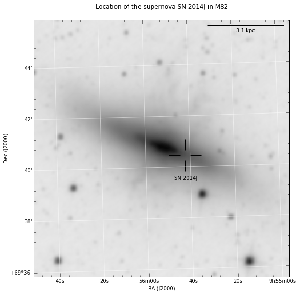
Final image with the custom marker
The publication-quality image obtained using the step-by-step commands listed above is:
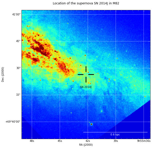
A similar example, using an HST observation, is:
More information on APLpy
The official website of APLpy is an excellent resource. The tutorial gives an introduction similar to the one above. The Quick reference Guide summarizes all the commands and gives useful examples.