In order to start teaching Software Carpentry I went through the fourth online teaching course. In this blog post I try to sum up my experiences and tell some untold stories regarding that course.
Books: Buying or Borrowing?
Why bother borrowing books, if you can also buy them? Since this was the fourth incarnation of the teaching course, I assumed the literature to be of high quality. And I was right. Both books, ‘How Learning Works’ and ‘Facts and Fallacies of Software Engineering’ are of high quality and I do not regret investing into these books.
While I learnt a lot from ‘How Learning Works’, I noticed that many of the research results presented in this book somehow ‘proved’ what I felt to be true for quite some time. The only downside of this book is its repetitiveness: the strategy section is – to a varying degree – a repetition of the other parts of each chapter.
‘Facts and Fallacies of Software Engineering’, while still being highly interesting, was less interesting than ‘How Learning Works’. The main reason is the style of writing. I had the feeling that the author does not want to be criticised for his work and to make sure he put ‘But remember, what I present as a fact is not really a fact, I am just calling it a fact. :P’ on every other page. Apart from that, even if one does not concur with the author, all facts and fallacies listed in the book confront you
- with the underlying issues and
-
the author’s view on them. </ol> And that is, why I value this book.
Concept Maps
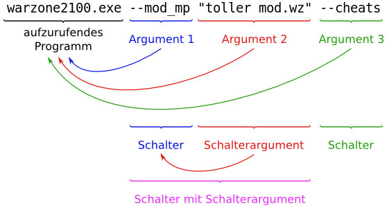
Our first task involved the creation of a concept map. I chose the topic on which I worked before in the sense of ‘explaining it to others’: Command Line Parameters. This is, in part, based on an article for my German site Warzone2100.de called ‘Kommandozeilenparameter’ (literally: command line parameters). You will notice an image very similar to the central example in my concept map. When I first created that image several years ago, I was especially pleased with the visual representation of the different levels of interpretation of the different parts of the command line. And that is the reason for trying to carry this over to my concept map.
When I created the concept map, I had not read the appendix on concept maps in ‘How Learning Works’. I just started work on the concept map without wasting any thought on ‘not adhering to the standard’ and I think this is the main problem of concept maps: they can restrict you too much, especially if you strictly adhere to the rules on how to draw concept maps. But still, nobody can force you to create concept maps according to some RFC or ISO standard, so one should use this freedom. And, on a sidenote: rejecting the whole idea of concept maps without trying to produce some and improving them is a bad idea. Trying to reduce the amount of information to fit into a concept map can open up new ways of thinking to the author. And ‘How Learning Works’ actually taught me why this is necessary: if you are an expert, you are so damn good that you can become unaware of how hard it was to reach your level and easily ask too much of your students. Or in one sentence: That three year old does not know how to solve differential equations.
Assessment Questions
When I applied for the SWC boot camp in Weihenstephan/Munich, I had to go through assessment questions. And that is also what this part was all about: assessment questions. How can you distinguish three types of proficiency: novice, competent, expert
.
The topic I chose is Permissions. The main problem here was not to find questions, but to find suitable questions.
Experts have the ability to switch back and forth between different knowledge organisations. Therefore, I doubt that it is even possible to distinguish competent practitioners from experts with two reasonably short/long question. The competent practitioner could be able to answer the question correctly by chance, while the expert could also solve a bunch of related and more distantly related questions. I think that you would need at least five questions which all aim at different knowledge organisations in order to be reasonably sure that someone is a true expert and not only a lucky competent practitioner.
And that is also what I see as the biggest issue with my expert vs. competent questions: it could be by chance that the competent person knows about the different mount parameters for ext filesystems. Also, it is hard to come up with expert-answerable questions if you have a small scope such as ‘permissions’ only. Today, I feel that the second question is not really an expert-answerable question, but more a niche-knowledge-answerable question.
I wrote some explanatory text for how I came up with the questions, but I forgot to give the answers to the questions. I would like to have some explanations for all questions, maybe this could be implemented in future rounds. Since all of what we were doing here serves to improve our teaching abilities, writing down what you thought when designing the questions can give valuable insights.
Facts and Fallacies Presentations
In the third round we created presentations on one or more facts and/or fallacies of the aforementioned book.
Everything noteworthy on this round is actually contained in the presentation already. Prior to fact 44 I did not know that there actually is something like ‘maintenance documentation’. I thought about how cool it would be to have such a thing in addition to a manual. When I did my bachelor’s thesis I worked with a multi-angle laser light scattering device, which was around 15 years old. And I noticed that the documentation on it was awesome. In order to set up this device you first had to prepare several factors and stuff and the manual told you so much that you – in theory – could calculate everything on your own if you only had the detector signal (a voltage). Since then I never ran across such detailed manuals again, unfortunately.
I disliked this round, because I dislike creating presentations. Why? Starting in school up to now everybody seems to crave for more and ever more presentations and the main argument is ‘because you need to learn how to present yourself and stuff!’ and I am quite sick of this after 10+ years. Especially since just creating/giving presentations does not automatically lead to better presentations. But I will stop here, before this ends in a page long rant

Videos: Screencast and Whiteboard
The most fun round was the video creation round, although video editing still sucks. For the screencast I chose the topic ‘Histogram Equalisation with GIMP’ and for the whiteboard session ‘PNG & optipng’.
What I liked most about this round is the amount and high quality of comments. The following things I found most useful and interesting:
- Video creation is time-consuming
- Greg hinted at this during the meeting on 2013-05-28. If something’s on a video your own expectations rise, since on TV everything is always so perfect.
- That is true, but on the other hand, if you are aware of this, why not be satisfied with imperfect content? Deliberately uploading a video with known issues cannot harm that much. You should write some accompanying text for the video anyway, so you could add a ‘known issues’ section. It’s Software Carpentry, software people are used to this.
- Record audio and video for screencasts at the same time
- I did not do it here, because I wanted to keep the video below 3 minutes. And that was more important to me than having perfectly matching audio and video.
- Use ‘still images’ for short pauses (mouse movement, voice), if you need to redo a certain part, because you messed up.
- Check that the recorded part of the screen and the popup location of windows match.
- Be careful with topic selection for whiteboard sessions. Some topics, especially those heavy in command line use are not suitable for whiteboards.
- Add something to the board while talking, do not start with the complete drawing.
- Make sure audio is recorded loud enough.
One thing remains, which really surprised me: Greg’s comment.
— screencast: you have a very calming voice
 And you speak very slowly in this video.
— whiteboard: speak more quickly (closer to average listening speed) — good body language, but again, everything on the board to startHighlighting done by me. Graphical smiley by WordPress… *sigh*
Ever since I started giving presentations people kept telling me one thing: ‘You are too fast, speak more slowly.’ So, what’s wrong here?
Different languages have different speeds, but still the same information rate. So, obviously Germans are generally slower and I am too fast for most of the other Germans, so I need to throttle. And I practiced this for years up to a point where I am not considered too fast anymore – by Germans! Unfortunately/fortunately, this does not hold for English, if the audience consists of native speakers. I also notice this when comparing English vs. German news shows: Germans are just so f*ing slow and talk very clearly, while the British or Americans are **comfortably fast at the expense of clarity (e. g. I do not get every single word). For me this means that I do not need to hold back when presenting something in English and I can concentrate fully on the content I want to present
Teaching + Feedback
Not yet done and will be in its own blog post anyway.
General Remarks
- Reorganise blog categories such that you have one parent category ‘Round 4′ and everything else in the sub-categories ‘Round 4.1′, ‘Round 4.2′ etc.
- The reorganisation will probably also allow for people to use feeds for their round only. afaik WordPress supports such things.
- Use one and only one platform to communicate teaching-related stuff. We had e-mail and the blog (and maybe even more I am not aware of). I prefer e-mail.
- Make single blog posts for everything and do not gather all videos/presentations in one blog post. The comments sections for those two rounds are a mess.
- Exclude the articles from the different rounds from the main page completely, so that they only appear when you click on that category. That way new rounds starting and old rounds ending do not interfere. Plus, those articles are not interesting for the general public anyway.
- For the assessment questions, ask people to write down what they thought when writing the questions.
- Give an outline of course contents at the beginning. I have the feeling that I read this somewhere recently… *hint* *hint*
- Give more time for rounds 3, 4 and 5. My suggestion is three weeks for rounds 3 and 4 and four weeks for round 5.
- Disable graphical smileys and never re-enable them. Graphical smileys suck at so many levels. I hate them. For example, the
 smiley does not look anything like it’s sticking out its tongue! And if, for whatever reason, you need to write ‘:’ followed by ‘P’ WordPress will autoidiotically convert this to a smiley.
- Video creation is time-consuming
-